iPhone 5 Display Size and Web Design Tips
September 13th, 2012 by Kyle J. Larson
Apple’s newest phone, the iPhone 5, was announced yesterday and it will be available to the public on September 21st. The biggest change for web designers to be aware of is the new screen dimensions. While app developers will have to make updates for their apps to run in full screen, our websites will simply have more available screen real estate. Web designers should be aware of what will be displayed before scrolling (what is above the fold) and how to update the start-up image for your web app.
The directions below apply to the iPhone 5s resolution and icon settings as well.
iPhone 5 Resolution
The iPhone 5 resolution has increased to 1,136 x 640 px at the same 326 pixels per inch (ppi) as previous Retina Devices. The iPhone automatically scales the viewport to fit 980 px so it works well with most webpages without any changes. If you’d like to specifically target the default screen size of the iPhone for a mobile site you can add the following metatag:
Apple has a reference of the available options for the viewport metatag.
The default full screen size of the iPhone 5 is 320 x 568 px (w x h). This is half of the screen resolution because of the pixel doubling in a Retina Display. If you’re looking to see what will be displayed ‘above the fold’ (what the user can see before scrolling), you’ll also need to keep in mind the size of the OS bar and the browser UI. Here are the key numbers you’ll need to know for previous versions of the iPhone and the iPhone 5:
iPhone Resolution Comparison
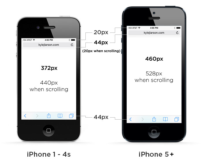
*Updated for iOS7. On versions older than iOS7 the browser bar has an additional 16px
| iPhone 1-4s | iPhone 5 | |
|---|---|---|
| Portrait (WxH) | 320 x 372 px (320 x 440* / 320 x 460**) |
320 x 460 px (320 x 528* / 320 x 548**) |
| Landscape (WxH) | 480 x 212 px (480 x 280* / 480 x 300**) |
568 x 212 px (568 x 280* / 568 x 300**) |
* – measurements with the small browser navigation bar
** – measurements without any browser chrome for a web app
Check out my updated article if you’re looking for the iPhone 6 screen size.
If you are building a website that you would like to work well on many devices, I’d highly recommend looking into responsive webdesign. Ethan Marcotte has a great article on Responsive Web Design at A List Apart to get you started.
iPhone 5 Web App Not Fullscreen
If you’re having issues with your web app not running at full screen on iPhone 5 (web app is letterboxed), it is likely due to an issue with the viewport metatag. The new iPhone doesn’t seem to like the width being set in the metatag. When you remove it, the issue is fixed. For example:
Broken Code:
Working Code:
You may also need to remove the status bar style if you had it set previously. For example this should be removed:
iPhone 5 Startup Image
Updated based on code shared by K K in the comments below.
If you’d like to make your website a web app so users can save it to their phone and run it similar to an app, you can make an iPhone startup image to display while the page is loading.
First make sure you do not have width in your viewport metatag, that seems to make web apps run in the smaller mode, as mentioned above.
Then add the web app metatag:
Then create graphics at these sizes for compatibility with each phone:
| iPhone 1 – 3gs: | 320 x 460 px |
|---|---|
| iPhone 4 – 4s: | 640 x 920 px |
| iPhone 5: | 640 x 1096 px |
Then add the code in your page’s header to link to them:
iPhone 5 Retina Images
The iPhone 5 supports retina images just like the iPhone 4 & 4s. There are a variety of methods for adding these images, but the basic concept is to create an image at 2x the size you’d like it displayed and then tell the browser to display it at half of that size. The Retina Device will see the extra pixels in the image and display them. I’ve written a blog post on some methods for adding Retina images to your website for reference. The startup images described above are Retina-ready.
iPhone 5 Web App Icons
The iPhone 5’s icons are the same resolution as the Retina iPhone 4/4s. Here is a blog post describing how to create an app icon for your site.
iPhone 6 Screen Size
Check out my updated article if you’re looking for the iPhone 6 screen size.

25 Comments
K K
I tried this:
and I putted [email protected] sized 640*1096 in ‘images’ dir
but the web app still start up in 3.5 inch mode.
What’s wrong with my code? Here is all my settings of launch image
Kyle Larson
Interesting, thanks for testing this out… I wrote the code based on how the previous iPhone worked but haven’t had a way to test it out yet. I added in above that it doesn’t seem to be working from what I’ve heard from a couple people now. Apple hasn’t updated their documentation yet and I haven’t seen anyone mention that they have the startup image working.
I’ll update if anyone can figure out how to fix it.
K K
So apple made this mistake. Thanks for reply : )
K K
Oh god, i did it!
later i’ll post the code i use
K K
This code will do the trick:
Kyle Larson
Awesome, nice work. Thanks for sharing the fix!
luk
does someone know how to make the bookmarklet work with the iPhone 5 which activates the appmode on the current site?
I’ve already tried some things but it just won’t display fullscreen. The original bookmarklet looks like this:
http://cl.ly/text/1H1b3E3K3T0V
Jared
Hi Kyle, I add the code for the iPhone start up image to my site, and the iPhone 5 start up image works, but the images for the iPhone 4-4S and iPhone 1-3GS do not work. Any ideas on what might be going on. (I have test it on my site and on a fresh html page. Still not working)
Andrew Kramer
Hey Kyle, thank you for posting this article. Do you know if it’s possible to disable the pixel doubling? I really have huge problems with optimizing my project for iPhones.
Kyle Larson
Nope, there isn’t since it’s part of the hardware. The idea is that anything should still work, it just won’t look great. If you’re not already familiar with how retina images work here’s a few ways you can implement it: http://www.kylejlarson.com/blog/2012/creating-retina-images-for-your-website/
I’d suggest just hitting the ‘high value’ targets first. For example a logo in your template or something on your homepage that sticks out. Anytime you can use CSS instead of images that’ll help too (since that automatically scales).
fix iphone screen
Have you been upset about the fact that you purchased a black iPhone 4 because Apple was having issues producing the white model? Have you been waiting for a solution to keep your current device and have the ability to switch between the two? If this topic relates to you, look no further, the following article will describe a stepwise approach on how to convert your black iPhone 4 white one.
alison57
Many thanks for the exciting blog posting! I really enjoyed reading it,
Alan
So which is it? Does an iphone 5 have a resolution of 320×568 or 640×1136?
Kyle Larson
The resolution is 640×1136, but the phone is shrinking images to be displayed in half the space (which is what makes retina displays look so sharp).
It can be fairly confusing…. so the rule of thumb is if you’re creating images go for the larger pixel doubled (640×1136) resolution, but if you’re writing CSS code use the smaller (320×568) measurements that those large graphics are being compressed into.
Alan
So even though Apple and Google advertise these large retina resolutions, you still design/code according to the old resolution sizes? Do you know if there is a list or any way to look up what devices’ actual resolution sizes are?
Kyle Larson
Right, most of your design (images) should focus on the the resolutions they advertise…. but if you’re setting breakpoints in css for a responsive design, it’ll actually break at the smaller value. There is a list of dots per pixel (dppx) here for reference: http://dpi.lv/
Alan
So do you just guestimate some where around 400px max-width for phones, 800px max-width for tablets, and 800px min-width for desktops?
Kyle Larson
Yep, that should work fine for the retina image. You could do that or create at image at say 1000px but then in the code say width=”500″.
And now that there are so many different devices at just about every size, its more important to just pick some points that work well as breakpoints for your content so it looks good at any size. Like if my navigation and logo no longer fits at around 500px that might be a good breakpoint to change to a menu that will work on mobile, or if the sidebar is no longer useful at 700px you could move it below the content at that size.
You can keep in mind the device types that fit in that range but generally let the content dictate where you set max/min widths.
Alan
Right, it is just confusing when they advertise retina resolutions when that isn’t the actual resolution. If a sidebar is no longer useful on a tablet or phone and you want to drop it below as you described, you could set a max or min width around 700px to change this, but for a long time I thought tablets and phones were actually running 2000+ pixel wide screens, and would therefor still show the full site even on your tiny phone.
Alan
Also, if you use an image twice the width of its div, but set an img width 100% so it squeezes in there, will a retina display understand it is a higher res image and display it at its higher resolution?
JP
Thanks for the great info! Do you also have visible area for the iPad on IOS 7 with safari 7?
jeffibacache
Thanks pal!
James Brown
Before designing and developing an applications for different mobile phones and different platforms then you really need to have a complete and firm knowledge about these devices and about these operating systems or platforms for which you are going to develop an application.
Affordable Web Application Development
jiayu g5s
Thanks for the article, great share!
yh
good