iPhone 6 Screen Size and Web Design Tips
October 1st, 2017 by Kyle J. Larson
Apple updated its iPhone a bit ago making the form factor much bigger. The iPhone 6 screen size is both wider and taller and the iPhone 6 Plus also has a higher pixel density. This is an update to my previous post about designing websites for the iPhone 5. It’ll cover these new screen sizes and try to clarify how this all works.
Update: Apple has released the iPhone 6s and iPhone 6s Plus. The iPhone 6s screen size is identical to the previous iPhone 6 versions, so feel free to follow the existing sizes below.
Update 2: Apple announced the iPhone 7 & 7 Plus. These iPhone 7 models follow the same screen sizes as the 6s & 6s Plus, you can use the sizes listed below.
Update 3: Apple announced the iPhone 8, 8 Plus, and iPhone X. These iPhone 8 models follow the same screen sizes as the 6s / 7 & 6s Plus / 7 Plus, you can use the sizes listed below. The iPhone X is a new size and has been added to the charts.
iPhone Screen Measurements
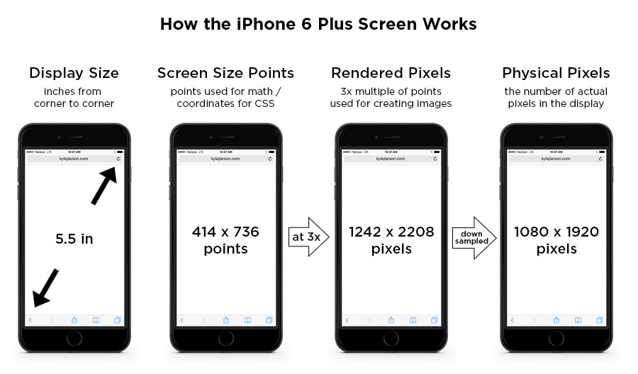
There are a few different values to consider when looking at the iPhone screen sizes. I’m going to get these values defined here so the chart below makes more sense:
iPhone Display Size (inches) – This is diagonal measure of the screen, from corner to corner, just like you’d measure a TV.
iPhone Screen Size (points) – These points are the size that the device is using for coordinates. If you’re designing for the web (using CSS or JavaScript) these values will be helpful. iPhones use Retina screens which have a higher pixel density. This means they take the larger iPhone resolution (mentioned above) and compress those pixels into a smaller space to make the image look sharper.
iPhone Rendered Pixels – This is the full number of pixels that are being rendered. This is the value you get when you apply the multiplier (1x, 2x, 3x) the device uses to the screen size in points. If you’re creating an image and want it at the max resolution, this is the size you’d use. I’ve also written an article on Retina images if you’d like to learn more.
iPhone Physical Pixels – This is the actual screen’s pixel resolution. The iPhone 6 Plus is using a a larger image resolution on a screen with a smaller number of physical pixels, so it needs to be downsampled to this size. This value is really only important in a specifications perspective, but shouldn’t really affect your designs.
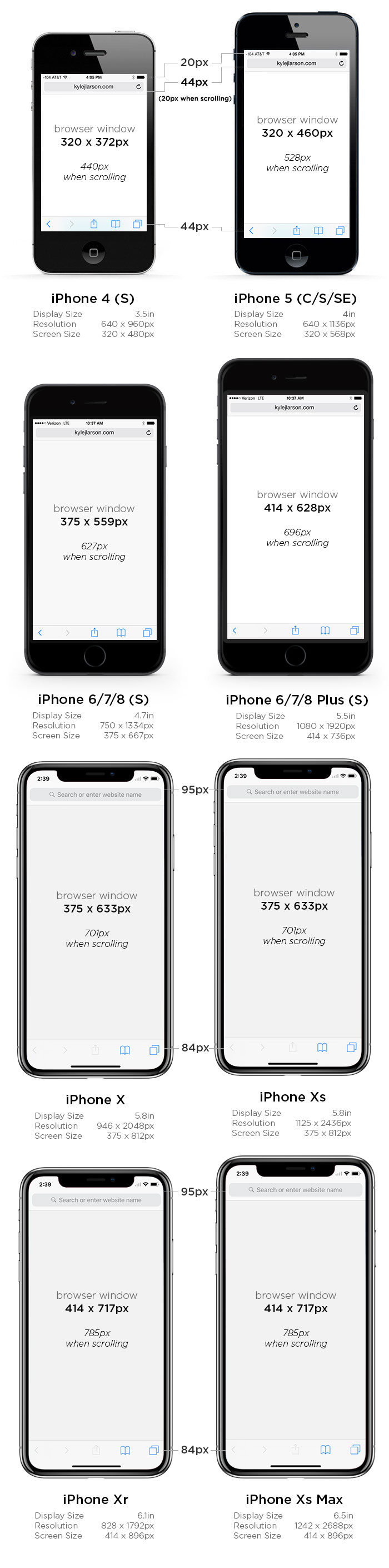
iPhone Screen Size Comparison
This image shows the browser screen size of the iPhones for use when writing CSS. See the table below for all the measurements of each phone. If you’re using iOS 8 the Safari menu height is consistent across all the iPhones.
Current iPhone Models
| iPhone Xr | iPhone Xs | iPhone Xs Max | |
|---|---|---|---|
| Display Size | 6.1 in | 5.8 in | 6.5 in |
| Screen Size | 414 x 896 points | 375 x 812 points | 414 x 896 points |
| Rendered Pixels | |||
| Physical Pixels | 828 x 1792 | 1125 x 2436 | 1242 x 2688 |
| Pixels Per Inch (PPI) | 326 | 458 | 458 |
| Browser Size Portrait | |||
| Browser Size Landscape |
* – measurements with the small browser navigation bar
** – measurements without any browser chrome for a web app
Previous Gen iPhone Models
| iPhone 6/7/8 | iPhone 6/7/8 Plus | iPhone X | |
|---|---|---|---|
| Display Size | 4.7 in | 5.5 in | 5.8 in |
| Screen Size | 375 x 667 points | 414 x 736 points | 375 x 812 points |
| Rendered Pixels | 750 x 1334 (@2x) | 1242 x 2208 (@3x) | 1125 x 2436 (@3x) |
| Physical Pixels | 750 x 1334 | 1080 x 1920 | 946 x 2048 |
| Pixels Per Inch (PPI) | 326 | 401 | 458 |
| Browser Size Portrait | 375 x 559 px (375 x 627* / 375 x 647**) |
414 x 628 px (414 x 696* / 414 x 716**) |
375 x 633 px |
| Browser Size Landscape | 667 x 267 px (667 x 335* / 667 x 355**) |
736 x 306 px (736 x 374* / 736 x 394**) |
812 x 280 px |
* – measurements with the small browser navigation bar
** – measurements without any browser chrome for a web app
Older iPhone Models
| iPhone 4 | iPhone 5 | |
|---|---|---|
| Display Size | 3.5 in | 4 in |
| Screen Size | 320 x 480 points | 320 x 568 points |
| Rendered Pixels | 640 x 960 (@2x) | 640 x 1136 (@2x) |
| Physical Pixels | 640 x 960 | 640 x 1136 |
| Pixels Per Inch (PPI) | 326 | 326 |
| Browser Size Portrait | 320 x 372 px (320 x 440* / 320 x 460**) |
320 x 460 px (320 x 528* / 320 x 548**) |
| Browser Size Landscape | 480 x 212 px (480 x 280* / 480 x 300**) |
568 x 212 px (568 x 280* / 568 x 300**) |
* – measurements with the small browser navigation bar
** – measurements without any browser chrome for a web app
Note that the iPhone 6 Plus is a 3x screen. For the previous iPhones you can double the screen size values to figure out the max size of your retina image, but on the iPhone 6 Plus you’ll want to triple that value (i.e. a full screen graphic would be 1242 x 2208).
Using the iPhone 6 Screen Size for Web Design
If you’re coding your site using Responsive design in order to fit the iPhone well, you may have some sizing issues if you don’t tell the device not to zoom in. You can do this by adding this viewport metatag into the head of your site:
<meta name="viewport" content="initial-scale=1.0">iPhone 6 Startup Screen
If you’re going to be setting up your website so users can save it and run it as a web app you can add a startup image to display when the page is loading.
First add the web app meta tag (also make sure you’re not using a width in your viewport meta tag as this can cause issues):
<meta name="apple-mobile-web-app-capable" content="yes">Then create startup images at these sizes for compatibility with each phone:
| iPhone 1 – 3gs: | 320 x 460 px |
|---|---|
| iPhone 4 – 4s: | 640 x 920 px |
| iPhone 5: | 640 x 1096 px |
| iPhone 6/7/8: | 750 x 1294 px |
| iPhone 6/7/8 Plus: | 1242 x 2148 px |
Then add the code in your page’s header to link to them:
 	<link rel="apple-touch-startup-image" href="images/ios_startup.png">
 	<link rel="apple-touch-startup-image" href="images/[email protected]" sizes="640x920">
 	<link rel="apple-touch-startup-image" href="images/[email protected]" sizes="640x1096">
 	<link rel="apple-touch-startup-image" href="images/[email protected]" sizes="750x1294">
 	<link rel="apple-touch-startup-image" href="images/[email protected]" sizes="1242x2148">
iPhone 6 Icons
When designing iPhone 6 icons you’ll notice there is a new size for the higher pixel density iPhone 6 plus. If you’d like to add an icon to your site that people will see when they save it to their homescreen, take a look at my article on creating an iPhone icon, which includes the sizes you’ll need.

75 Comments
Matt
Great info, but the irony is that this site itself does not scale properly on my iPhone 6+, forcing me to scroll horizontally to view content…
Kyle Larson
Hey Matt, thanks for pointing that out. I’d been playing around with my CSS and had messed up the media queries a bit. It should be working better now.
Matt
Ah, much better! Thanks… Those media queries can be tricky. Cheers on a great article!
Kimmy
Thank you! This post is going to be super helpful!
Simon Woodard
Great summary mate. The table of ratios is a great resource. Thanks
Amelie Fernandez
Great !!!!!!!!!!!!!
MaxandImum
I have one question about Iphone 6 plus, should i design (designs that i hand to developers) in 1080 x 1920 or 1242 x 2208.
Bis
“on the iPhone 6 Plus you’ll want to triple that value (i.e. a full screen graphic would be 1242 x 2208)”
Chris Shannon
yes, some users don’t enable 3x and are at 1080×1920.
Craig R Morton
Nice post, thanks
abl
Thanks for the post really useful mate… 🙂 Before this post I was lil bit confuse about iPhone 6 and 6 Plus screen size, thanks for the clarification.
brad barber
Kyle, I was having a screen fill issue with an Adobe Muse build. I added your viewport metatag and it fixed the issue. Great article, thanks.
Kyle Larson
Thanks, glad it was helpful Brad.
naldjb
i have been looking for this for soo long, i guess the keywords im using wasn’t right.. i was searching for “iphone safari browser bar height”.. anyways thanks for the big help, now i don’t need to do a screenshot on all these devices and measure them manually..
Kyle Larson
Welcome, glad you found it!
Hospity
Great information.. Awesome Thanks..
Responsive Web Design India
Ed G.
why in screen size where images are pixels instead of points?
Ela Yudhanira
very useful … thank you 😀
Joel McDonald
This guide was a lifesaver! Thank you so much!
Antonella Andyworld Spagnoli
if I design an app for iPhone 5 (I’ve always designed things setting my file with the following: 640×1136 or taller at 71 dpi)
Antonella Spagnoli
That is very interesting and I thank you for sharing it! I still have a couple of doubts though. I’ve always designed @2x using iPhone 5 rendered pixels (640×1136), even if I read someone recommends to use points @1x for designing.
I use for my UI design Photoshop vectors and/or imported illustrator vectors. My dpi settings files were always 72. I was sometime asked to provide higher quality raster images for iPhone 6 Plus, in order for the developer to export them @3x. Now I have to design a game and I am going to paint some parts directly in Photoshop like backgrounds or some UI with painted decorations and textures (it’s an app for kids). I was told that is fine to provide graphics using same specs as always, 640×1136 at 72 dpi, but my fear is that, if I design something using digital painting only and a new iPhone with a better screen resolution comes up (@4x, @5x etc), my illustrations are going to look blurry sooner or later if i don’t increase the dpi. In your opinion, it is a good idea to work directly using rendered pixels for iPhone 6 plus (1242×2208) with a higher resolution (I was thinking, which is definitely good for printing, 300 dpi)? Thank you very much
Kyle Larson
If you’re going to be creating graphics that aren’t vector based (meaning they pixelate as you scale them up), it’s definitely a good idea to create them at a larger size like you mentioned. Either by increasing the pixel resolution or the DPI (if you’re saving as a PSD file). Then you can just resize down to whatever dimensions are needed for the device. Then you’ll have a good resolution for any purpose (print or digital) for the future.
Brig
Yes i had the same question as Antonella! Below 🙂
Rodrigo Carrasco
great post – thanks antonella/kyle for query/answer.
Anurag jain
i have one question
i make design in photoshop for ios app so what is the dpi for iphone 6s size
Kyle Larson
Hey, thanks for asking. I took a look and the iPhone 6s is the same size as the other iPhone 6 versions, so you can just use those pixel values (for the regular iphone or the larger plus version).
Simcha Yaffa
Hi Kyle !! thank you for the information,
I don’t really do any coding, I am designing a website in Photoshop at 72 dpi and and importing the assets into edge reflow, i start my design at 240 px and then add a media querie/scale it up from 320px to 360px/360px and so on. now i have no problem with the vector objects but what dpi/restitution/ how do i import the graphics ?and what size should i be designing on in photoshop ? let’s say i design the website 320px with so i should make it in photoshop at 640px and import it into edge reflow and scale every thing down ?
Kyle Larson
I haven’t used edge reflow myself, but I’d recommend designing your graphics at least 2x your final size. So if an image would be 320px at max width I’d do 640 like you mention. If it’s a responsive site, and the image could be larger in the desktop version, go with that size to avoid it getting too pixelated (you’re always able to scale down).
Lawrence Guzzetta
Very clear info Kyle – lots of other confusing posts out there – thank you.
Tommy Simpson
Many thanks for the well presented information
Mikael Rasmussen
Nice information. Most articles about Iphone screensize, does not take into account top and bottom bar of browser, they just list full screensize.
Now problem is just making content 100% in height, when Iphone 4 and 5 have same width but different height 🙁
A. Brandstrup
Hi Mikael
Have you tried viewport units such as vh and vw? http://caniuse.com/#feat=viewport-units
Miloš
Very nice article. Thanks!
Jake Miller
Not a developer just a photographer. What size should I be exporting my images to my website if most of my clients own an iPhone 6s?
Andu @ Widgetic.com
It depends how your clients see the photos. Do they see them fullscreen in your gallery? If yes, than there should be a version that fills the entire browser wxh. For thumbnails I presume you use different sizes, so it’s best for those images to be optimised for their size. Only load the large images when the client interacts with them.
If the gallery you use also has zoom features, than the size should be larger, as large as you’re ok to allow your clients to download when clicking a photo.
Mathyeux
Thank you for the viewport meta element tip! It really makes the difference 🙂
Gabriele Carboni
Hello, very useful article, thanks. Please update with new iPhone SE specs ASAP.
Kyle Larson
Thanks Gabriele! The iPhone SE has the same screen size specs as the iPhone 5, I’ve made some updates above.
Amy Nguyen
Thanks for your info
worktasker
thanks very good article
thanks very much !
http://www.worktasker.com
Georgiana Andree
hi Kyle, i join the club, thank you for your very useful articles and for your effort. you’re going to bookmarks 🙂
Bambang Sugendeng
Hi Kyle, This nice article. Can you explain if I start a page in Photoshop with 750x1334px at 72dpi, whether it will influence the execution of the coding process? Also, when I started the page with a resolution 72dpi, size of the document page looks W: 10.417″x H: 18.528″. Meanwhile when I started with 750x1334px with 326dpi, size page document looks W: 2.301″x H:4.092″. So, Which the best methods to start designing in Photoshop?
Cyber Creature
Thanks for useful article.
Daniel Henny
Thamks for the tips . to now more about this visit Web Design Coimbatore
Jeff Williams
Thanks for posting this, Kyle! I came across it while looking for display sizes for the 6S & this was really well done.
Fuzen Co.
Please do the same article but with iPad sizes please 🙂 Without taking chrome into account, it really does affect relatively positioned items when using percentages for placement. Chrome and Safari’s responsive tools don’t take this into account 🙁
Great article!
colink
Great article, I refer to it often. Would be good to have a similar set of screen sizes for popular Android phones.
DrLulz
Are startup screens available in iOS 9?
https://forums.developer.apple.com/thread/23924
Madhu Gauranga Das
thanks
chiarissima
Thanks for your article, it’s been extremely useful for me! Cheers!
Ivan Sinigaglia
Obrigado (Thanks)
Alan Hughes
So in CSS pixels/points/resolution an iphone plus is 414 x 736? Even though the actual resolution of these screen is much higher?
If I design a website that is exactly 414px wide and add a photo exactly 414px wide, will it display correctly or will ios stretch it out to the actual resolution of the screen? To 1242px?
Kyle Larson
Right, the screen size the browser sees and the amount of pixels are different (because ‘retina’ is cramming more pixels 2x-3x into less space). If you’re using CSS follow the 414 measurement (for designing your site widths). If you’re creating an image it’ll work fine at 414px, but because there are actually more pixels stuffed in that space you can make it sharper by creating a larger res image (1242px for example) and then it’ll be displayed at 414px. To make this work without scrolling you’ll usually need to set a width to the image or set either width: 100% or max-width: 100%.
Alan Hughes
Thanks for such a quick response, Kyle.
Just to make sure I’m understanding you correctly, browsers are smart enough to not stretch out photos and graphics?
Deborah
This is just what I was looking for. Thanks!!
Pol Goasdoué
Kyle
thanks for the article. My english is a bit broken so i probably missed something.
I have to design iPhone 6+ UI – with A. Illustrator / Sketch.
According to your article my file resolution has to be :
iPhone 6 Plus: 1242 x 2148 px
Has i refer to
https://material.io/devices/
i saw that iPhone 6+ – resolution is 1080 x 1920 with a 115% density.
Thanks
Pol
Brandon
Kyle, great article. Thank you! I’m curious, do you know where one can find the size of the Apple logo on the boot screens for each of the current iOS devices?
LumaD
This is super helpful and I appreciate the clear diagrams and the explanation of pixel densities and Retina display. You know your stuff! Grateful to learn this.
Macdara
Thanks for the article and examples with the browser resolutions, it’s really helpful
Fareed Khan
I want to ask the question if i make the iphone 6, 6s application design… can these images after import use in iphone 7 or 7s
kindly tell me… I am waiting your response…. thanks
Kyle Larson
Yes these will work on the 7 as well (note the chart with 6 & 7 mentioned). The only difference in size is whether the phone is the regular size or the larger, plus version.
Fareed Khan
Thanks alot Kyle Larson
vle
Great article, thanks!
Puneet
Thanks for sharing such an important information. This is important to one who is building the application for the first time.
I was making an image with screen width and that image comes blur due to rendered pixels then your article made my day :).
Thanks a lot for your efforts for putting it here.
Dylan
OMG THANK YOU SO MUCH THIS IS SO HELPFUL!!!!!
navin talawant
I am designing an application that will be run in web browser for iphone 7s. In pixel size, what should my axure/photoshop documents be?
Thanks
ktoshka
thanks, it is really helpful!
John Templeton
The most complete info ever and easy to comprehend! Thank You
Sagar
Good post. Thanks!
Media Genesis
I just read your blog about screen size and web design and found it very interesting, especially since we’ve a site similar to your blog! We have some additional information about viewports, iPad pixel sizes, and Androids on our site that you and your viewers may find interesting! Feel free to check out our site at http://mediag.com/news/popular-screen-resolutions-designing-for-all/ and share with your users if you think it would be helpful to them.
Greg Young
Help!!
If I measure my iPad screen to see where it falls in the size category, would I measure diagonally and include the dark border of the screen or just the viewing area? You know about this stuff, I don’t. Thanks!!
Matt
Great work! The article is very elaborative.
Dominic Watson
iPhone 8 actual scrolling height is 628px and not 627px (I have one and that’s what window.innerHeight reports)
Declan Lawton
This guide looks amazing! Even we can follow them for iPhone 12. Thank you so much!
deven
thank you so much