Business & Marketing
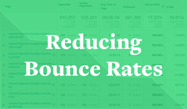
How to Reduce Bounce Rate and Improve Your SEO
Bounce rates can affect your SEO, but a bounce isn’t always a bad thing. Here’s how to target the ‘bad’ bounces and improve your site.
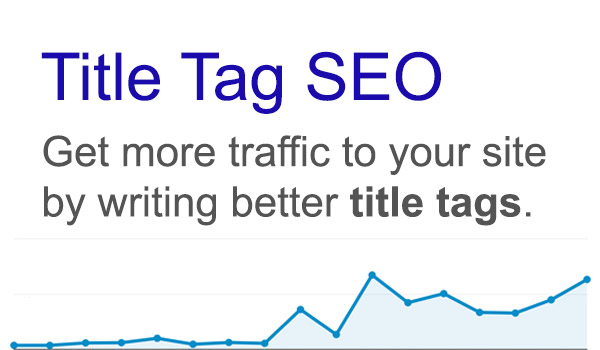
Title Tag SEO – How to Write Title Tags That Increase CTR
Did you know you could be losing tons of traffic by doing a poor job writing title tags? This guide will help improve your title tag SEO & increase traffic.

How to Make Your Web Statistics Actionable: Search
Use your web statistics to improve your website search.
WordPress

Starting a WordPress Site & Getting Hosting Setup
A guide to getting your WordPress blog up and running by setting up web hosting and running a simple installation of Wordpress.

The Best WordPress Plugins I’ve Found
Here’s a list of the best WordPress plugins that I’ve found and continue to use on all the sites I build.
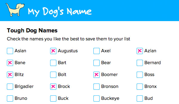
How to Create a WordPress Database Table
My latest site My Dog’s Name lets users search a database of dog names. Here’s how I added a custom table to my WordPress database and pulled the data out of it.
Design
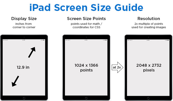
iPad Screen Size Guide & Web Design Tips
This guide will help you create responsive websites that adapt well to any iPad screen size or create web apps specifically targeted at the iPad.

15 Tips for an Awesome UX Design Portfolio
Having an awesome UX design portfolio is a key step to building your career. Here are 15 tips to make your design portfolio shine!
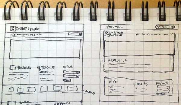
Finding a Better Web Design Process
Creating a successful website is all about process. A good design process helps you get the ideas out of your head and into a format that can help you make logical design decisions.
Code
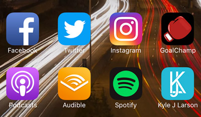
How to Add Icons for iPhone, iPad & Android to Your Website
Add custom icons to your website for the iPhone, iPad, and Android for users that save it to their homescreen to look like an App.

How to Create CSS3 Pie Charts
Learn to use the latest features of CSS3 to create pie charts purely from code.
How to Setup Your Site for the iPhone
Learn some settings you can add to your website to target the iPhone.