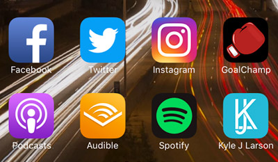
Posts Tagged ‘html’

|

How to Setup Your Site for the iPhone

Friday, October 22nd, 2010

iphoneI’ve been working on some mobile apps lately and realizing how simple it is to get started making your site more iPhone compatible. You can either create a separate site specifically for mobile or create a mobile stylesheet to be applied to specific devices. There are some great arguments out there for each option, but what I’m discussing here is just the introductory steps that work for either method. In writing this I’m also considering how I’d like to apply those ideas to my site here.

If you’re planning to create an additional stylesheet rather than a completely new codebase, you’ll want to start by specifying the stylesheet to use with a media query. Ethan Marcotte has a great article called Responsive Web Design that expands upon this idea on A List Apart. To target an iPhone/iPod specifically you can use this code right after your main stylesheet in your header:

<link media="only screen and (max-device-width: 480px)" href="iphone.css"
 type="text/css" rel="stylesheet">

Control the Page Size

Next you’ve got a handful of settings that will help make your site similar to a native iPhone app. If you want your page to resize to the device, you can use this line in your header:

<meta name = "viewport" content = "width = device-width">

or if you’re setting your page width in CSS and would prefer to use a specific scale (with or without the option to disallow users from zooming the page) you can use:

<meta name = "viewport" content = "initial-scale = 1.0, user-scalable = no">

Add a Custom Icon & Startup Image

There are also meta tags for use when your site is added to the home screen of a user’s device (press the ‘+’ in mobile safari to add to the home screen). The first is adding a custom icon to your site that I wrote a previous post about. In addition, you can add a startup screen to give an app like feel. To add a startup image create a png that is 320 x 460 pixels and add this line of code to the header:

<link rel="apple-touch-startup-image" href="/your_image.png">

Make it Look Like an App

You can make your site look more like an app when people save it to their home screen by hiding the top bar that loads with safari and changing the color of the status bar. Before you do this you’ll want to make sure you’re site is setup so it can be easily navigated without needing the back button. To remove the Safari controls add this meta tag to your header:

<meta name="apple-mobile-web-app-capable" content="yes" />

And to change the status bar (network name, time, battery level) from the default grey to either “black” or “black-translucent”:

<meta name="apple-mobile-web-app-status-bar-style" content="black">

Note that if you change the status bar to translucent the site will sit underneath it. Make sure that there is no critical content hidden behind the bar.

These simple lines of code are a great way to get started setting up your site for Apple’s devices. If you’d like to go into some more detail, Apple’s Safari Reference Library is a great place to get started. Then to take this to the next level I’d recommend digging into jQTouch or Sencha. Both of these tools will create an even more app-like experience with animated transitions and app-like bars & buttons using javascript (which you’ll want to have a strong knowledge of to use to their full potential).

Tags: , ,
Posted in HTML, mobile | 1 Comment »

HTML 5 Video with Flash Fallback

Thursday, July 15th, 2010

HTML5 has some exciting new changes, most notably tags for embedding audio and video. Currently not all browsers will fully support these tags, but with the ability to fallback on different formats until one that works for your browser you can start using them today. The greatest benefit of using HTML5 video tags right now is its compatibility across multiple devices, notably mobile devices. The majority of mobile devices, including the iPad and iPhone, are currently unable to run flash based players. Adding the video tag allows these browsers to play your videos with their built in controls, expanding your potential audience.

Video Formats

The first item to look at when setting up the video tag is your video formats. Web browsers don’t currently agree on which video format should be the leader for the web so to support them all we’re currently stuck providing video in multiple formats. The two most common formats right now are H.264 (typically .mp4) and Theora (typically .ogv). H.264 is great format and common across the web as YouTube and the iTunes store both use it, but has a disadvantage in that MPEG LA owns the patent to the format and could potentially charge to encode videos in the future. Theora has the benefit of being royalty-free, but isn’t currently as widely used or integrated into as many tools. Currently Firefox and Opera only support Theora, while Safari (iPhone & iPad), Android, and Flash only support H.264. Internet Explorer is behind in supporting the video tag, which makes the ability to fallback to a Flash based player very useful.

Encoding Video

To encode .ogg files I’ve used Firefogg, which is a plugin for Firefox. This tool makes it very simple to create ogg files (for batch encoding try ffmpeg2theora). Simply install the plugin and then in FireFox go to the “Tools” menu and select “Make Web Video”. From there select a file that you’ll convert and if you want you can change the output settings for quality or video size. Make sure to leave the default video and audio codecs of Theora and Vorbis both set.

To encode h.264 files I recommend HandBreak. To get started open the video file you want to convert. Choose the iPhone & iPod Touch Default settings in the right menu (window > presets drawer if its not up). Next you’ll want to set the dimensions of your video (Picture tab on PC / Window > Picture Settings on mac). Choose either a specific size you want or change it to match the source settings (as they have changed to a size specific to the iPhone). Check the “Web Optimized” box and in the video you can adjust the quality if necessary to keep your file small. If your video has audio click on that tab and change the setting to “AAC (faac)”. Now you’re ready to encode, either click start or add to queue and repeat this process with another video.

handbreak

Setting up the Video Tag

If you got all the conversions done correctly, now is the easy part. Simply add a video tag with the height and width of your video. Adding “controls” to the tag will allow the user to pause/play the video and adjust the volume (other options for the video tag include preload, loop and autoplay). Then list the source location of the videos you created above in the order you want browsers to attempt to play them. If they are unable to play the first file they will continue to the next one.

<video width="710" height="400" controls>
     <source src="video_file.mp4" type="video/mp4" />
     <source src="video_file.ogv" type="video/ogg" />
</video>

Tips: The iPhone currently reads only the first video source so you’ll want your mp4 file listed first. If you’re maintaining your own server you’ll want to make sure you have these MIME types added: video/ogg .ogv & video/mp4 .mp4.

Falling back to Flash

The next step to cover yourself for old browsers and the always behind Internet Explorer is adding a Flash Player to the end of the video tag. The nice thing is this will work just like it did for the video files, if the first two don’t work it’ll move right on to the Flash. You can add in whichever Flash player you’d like to use, but my preferred player is the JWPlayer, so thats what I’ll be using.

<video width="710" height="400" controls>
     <source src="video.mp4" type="video/mp4" />
     <source src="video.ogv" type="video/ogg" />

     <object width="710" height="424" type="application/x-shockwave-flash"
     data="js/player.swf?image=image.jpg&file=video.mp4">
       <param name="movie" value="js/player-licensed.swf?image=image.jpg&file=video.mp4" />
     </object>
</video>

That’s all there is to setting up an html 5 video tag. Here’s a sample:

Related Links

Here’s a few projects and informational sites to check out for html video:

Tags: , , , ,
Posted in HTML | No Comments »

Building a Dock with CSS Animation

Monday, July 12th, 2010

After seeing some interesting uses of CSS animation, I decided to make a fisheye dock using only html, css and some images.

Currently not all browsers will support the functionality, but it will function correctly in Webkit browsers (Chrome / Safari) and Opera. The latest full release of Firefox (as of the writing of this article) doesn’t support css transitions so it won’t have the nice fade effects.

Dock Setup

The first step is to create some transparent PNGs to use as images for the dock. Then add the images to a list and put the text for the image in a paragraph tag. I’m also adding a div tag that we’ll use later in setting up a text bubble.

<ul id="dock-container">
  <li>
     <a href="#"><img src="images/catalog.png" alt="catalog" />
     <p>Catalog</p><div></div></a>
  </li>
  <li>
     <a href="#"><img src="images/passkey.png" alt="passkey" />
     <p>Login</p><div></div></a>
  </li>
  <li>
     <a href="#"><img src="images/certification.png" alt="certification" />
     <p>Certification</p><div></div></a>
  </li>
  <li>
     <a href="#"><img src="images/mountbuilder.png" alt="mountbuilder" />
     <p>MountBuilder</p><div></div></a>
  </li>
  <li>
     <a href="#"><img src="images/rackbuilder.png" alt="rackbuilder" />
     <p>RackBuilder</p><div></div></a></li>
  <li>
     <a href="#"><img src="images/videos.png" alt="videos" />
     <p>Video</p><div></div></a></li>
  <li>
     <a href="#"><img src="images/calculator.png" alt="calculator" />
     <p>Calculator</p><div></div></a>
  </li>
  <li>
     <a href="#"><img src="images/mobileSite.png" alt="mobile site" />
     <p>Mobile</p><div></div></a>
  </li>
  <li>
     <a href="#"><img src="images/savedProducts.png" alt="saved products" />
     <p>Saved</p><div></div></a>
  </li>
</ul>

Next add some CSS to float the images in a horizontal line and lower their size in the default state so they don’t become pixelated when they are zoomed.

#dock-container {
     font: Helvetica, Arial, sans-serif;
     font-size: 12px;
}
#dock-container li {
     float: left;
     list-style-type: none;
     text-align: center;
}
#dock-container a {
     color: #ccc;
     text-decoration: none;
}
#dock-container img {
     border: 0;
     width: 75px;
}

dock menus step 1

Text Bubbles

Before we add the animations, we’ll stylize the text below the images to make them look like speech bubbles. The bubble is created using border-radius and the arrow using our first transform to rotate the empty div created above forty-five degrees.

#dock-container p {
     background: #000;
     border-radius: 8px;
     -moz-border-radius: 8px;
     margin: 0;
     position: relative;
     padding: 2px 4px;
     z-index: 100;
}
#dock-container div {
     background: #000;
     width: 10px;
     height: 10px;
     margin: 0 auto;
     position: relative;
     bottom: 20px;
     -moz-transform: rotate(45deg);
     -o-transform: rotate(45deg);
     -webkit-transform: rotate(45deg);
}

CSS Transitions & Animation

Now we’ll add the CSS to animate the menu. First we’ll define the transition that we’ll apply to all the animation effects on images and paragraphs so they fade (ease) both in and out. After that I’m going to define a transition specifically for the opacity transformation because I want it to show up much faster. Finally, we add the scale transformation to increase the size of any images by 1.4x within the link tag when its hovered over.

#dock-container img, #dock-container p {
     -moz-transition: all .4s ease-in-out;
     -o-transition: all .4s ease-in-out;
     -webkit-transition: all .4s ease-in-out;
}
#dock-container p, #dock-container div {
     -moz-transition: opacity .1s ease-in-out;
     -o-transition: opacity .1s ease-in-out;
     -webkit-transition: opacity .1s ease-in-out;
}
#dock-container a:hover > img {
     -moz-transform: scale(1.4);
     -o-transform: scale(1.4);
     -webkit-transform: scale(1.4);
}

Finishing the Text Bubbles

We’ve just about got a working menu now. The final step is just getting the text bubbles to display only when the links are hovered. To do this we’ll just add opacity of 0 to those elements and then change it to 1 when hovered. The transition we set in the last step will quickly fade it in and out.

#dock-container p, #dock-container div {
     opacity: 0;
}
#dock-container a:hover > div, #dock-container a:hover > p {
     opacity: 1;
}

Here’s the working example (download the html):

Tags: , , , ,
Posted in CSS | 1 Comment »